How To Use Icons To Provide An Appealing User Experience?
May 12, 2023

Before we begin with the core topic, let us help you understand what are icons and what makes a good icon:
What are Icons?
Icons are small images that represent a specific action or object. They can be used as part of the user interface of an app to communicate important information, such as the status of a task or an error message.
Icons are an essential part of any user experience because they help users understand what's happening on-screen without having to read text or navigate through menus and buttons. They also make it easier for users who may not be able to read English well (or at all).
What Makes a Good Icon?
-
Simplicity
Icons are an essential part of the user experience, so it's best to keep them simple and easy to understand. If you make your icon too complicated, people won't be able to tell what it represents. This can cause confusion and frustration for users when they're trying to use your app or website.
-
Scalability
If you want an icon that looks good at any size (from small on mobile devices up through large screen sizes), then scalability is important! Your icons should be created using vector graphics so they can scale without losing quality or clarity as they get larger or smaller in size.
Now that you know the basic concepts, let’s move on to our today’s topic and get to know how you can use the icons on your website or app to provide an appealing user experience to visitors:
How To Use Icons To Provide An Appealing User Experience?
-
Give a Proper Context
-
Icons Must Be Visible To One’s Eyes
-
Provide a Proper Guidance
-
Choose the colour of the icons wisely
-
Enhance Navigation
-
Data Representation
-
Use Icons As Action Buttons
-
Create a Brand Identity
-
Improve Accessibility
-
Give a Proper Context
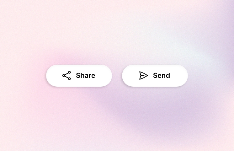
The icon should be able to tell you what it represents without having to read any text or other visual cues. When users see an icon they should be able to tell right away what it means without having to think about it too much. This is especially true when there are multiple icons with similar shapes or colours on the same screen at once. If each one needs its own label then this can make things confusing for your users who may not know which one does what!
-
Icons Must Be Visible To One’s Eyes
Icons must be visible and visually clear so that everyone understands them easily regardless of their background knowledge (or lack thereof). If someone has never seen an icon before then they need some kind of explanation as soon as possible so they don't get confused over which one represents what function/action within your app - otherwise they'll just click around randomly until something happens!
![]()
-
Provide a Proper Guidance
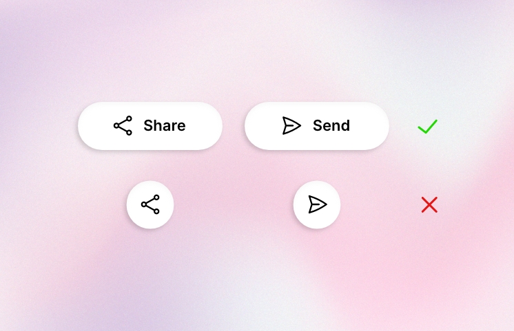
Your website/app should guide users through different steps by providing clear instructions through both words and visuals such as icons; this way everyone knows exactly where they stand at any given time during their journey through your product experience.
-
Choose the colour of the icons wisely
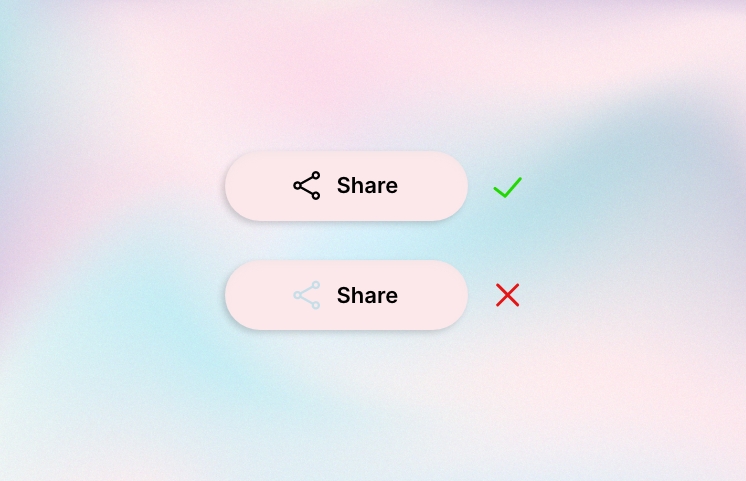
Colour is a powerful tool for conveying meaning. It's the first thing users see when they open your app, so it's important to use colour effectively. The way you use colour can help draw attention to certain parts of your icon and make sure that users understand what they're looking at.
Colour theory is an extensive topic, but here are some basic principles:
-
Use complementary colours for contrast and emphasis. For example, red text on a green background will stand out more than black text on white or grey backgrounds because there's more contrast between them (the red has more "pop"). This is also why we see traffic lights in red/green/yellow; it's easier for our eyes to pick up these bright colours than if there were only one shade used throughout all four lights!
-
Use analogous hues when you want something subtle but still noticeable--like when highlighting an action button within an app interface--but avoid using too many similar shades together since this can make things feel busy instead of organized (which defeats the purpose).
-
Enhance Navigation
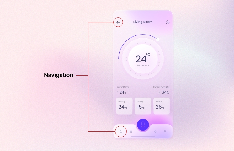
Icons can be used to create a consistent visual language, which helps users navigate the app and understand what they are looking at. You can use icons to enhance navigation in your app by:
-
Choosing the right icons
-
Creating a consistent visual language
-
Creating an intuitive navigation experience
-
Using Icons to Communicate Information
-
Data Representation
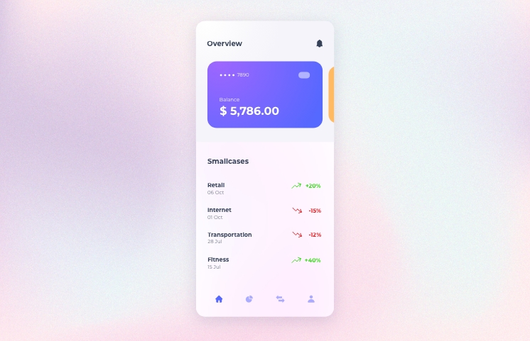
You can use an icon as a visual representation of data in your app. For example, if you have a list of items or tasks with their respective statuses (e.g., completed), you could use an icon next to each item's name (e.g., "completed" or "not completed") instead of writing out the word "completed" over and over again. This makes it easier for users who are scanning through lists quickly because they don't have time or patience for reading long paragraphs of text when there are other things going on around them!
-
Use Icons As Action Buttons
Another way that icons can help communicate information is by acting as buttons within your UI design--for example when someone clicks on an icon representing an action like "add a new task," then they will see another screen where they can enter details about that new task before saving it back into their system so everyone else knows what needs doing next."
![]()
-
Create a Brand Identity
There are a few ways you can use icons to create a recognizable brand identity. First, you should create a consistent icon style that is used throughout all of your products. This will help users recognize your brand and make it easy for them to find what they need within the app or website. Second, if there are any specific emotions associated with your product (such as happiness), try using icons that convey this feeling so people know what kind of experience they'll have when using your product.

-
Improve Accessibility
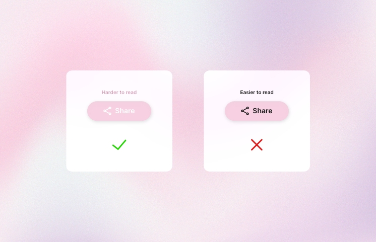
When you're creating icons, it's important to keep in mind that they can be used by users with disabilities. For example, if you have an app that provides a service for visually impaired people (like a navigation app), then your icons should have text labels on them so that the user can understand what they mean without having to see them.
Similarly, if you're designing an app for people who have motor impairments such as paralysis or cerebral palsy then using clear and simple graphics will help them navigate the app more easily.
Icons are an essential part of the user experience. They help create a consistent style and help users navigate your app or website. They also have a huge impact on how people perceive your brand, so it's important that you get them right!
Looking for some inspiration or need help with your next UI/UX design project? Check out our UI/UX services and feel free to contact us at admin@we3solutions.ca


